
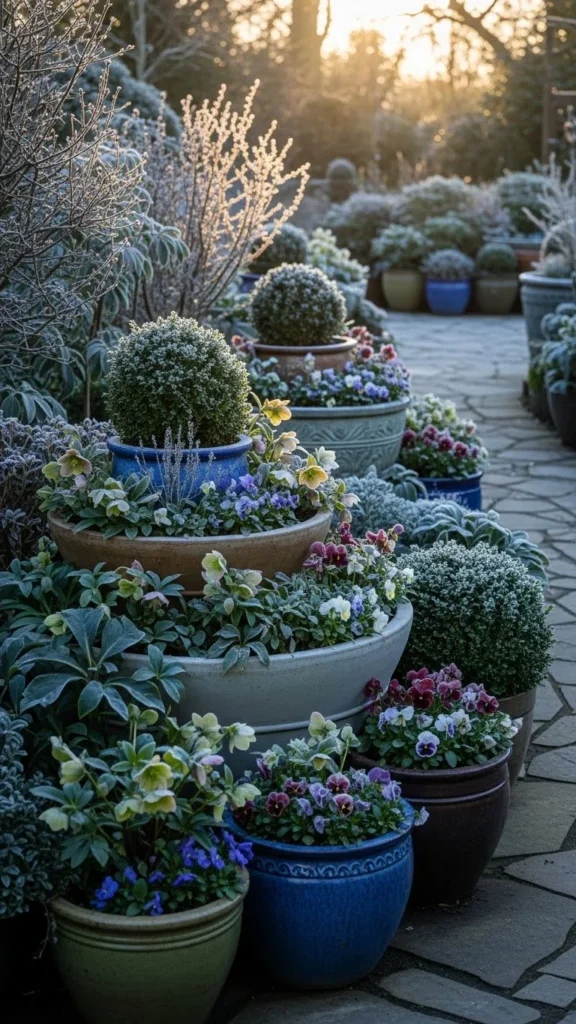
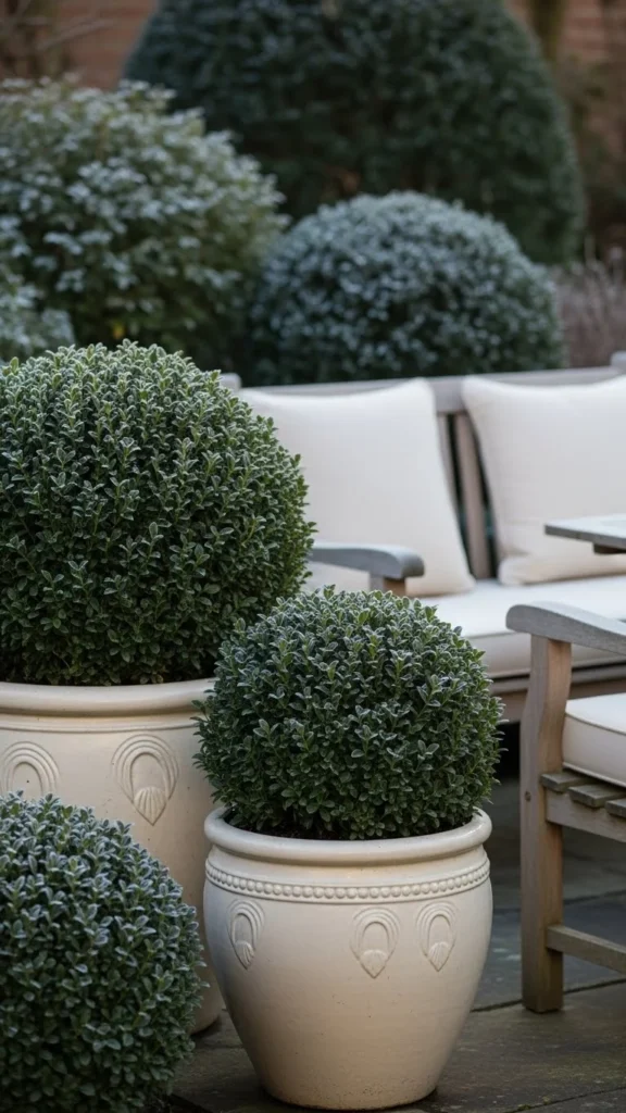
Winter gardens do not have to feel dull or lifeless. With the right color palette, even the coldest months can feel styled, welcoming, and visually balanced. Thoughtful color pairings help winter planters, paths, fences, and outdoor seating feel intentional rather than forgotten. This guide walks through 26 winter garden color palettes that work beautifully for real homes. Each idea focuses on simple materials, affordable updates, and easy DIY touches that photograph well for Pinterest while still being practical for everyday outdoor spaces.
1. Evergreen Green and Soft White
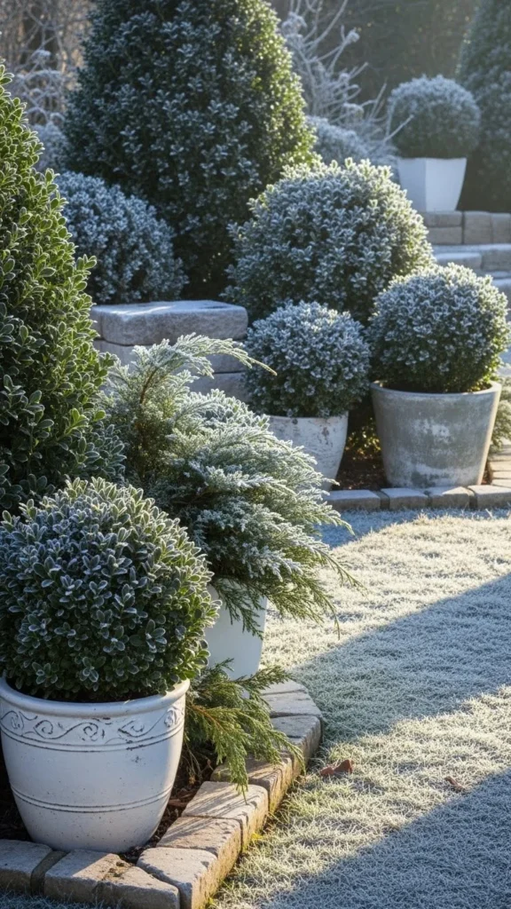
This palette relies on what already thrives in winter. Evergreen shrubs bring steady color when most plants rest. Soft white elements keep the space calm and bright.
Use white pots, pale gravel, or light stone borders to frame darker greens. Even budget plastic planters work if sprayed with outdoor white paint.
Add white garden stools or a simple bench for balance.
DIY idea: wrap old pots with white fabric or limewash terracotta for a chalky look.
This pairing works well for small patios and entry gardens.
The contrast photographs clearly without feeling harsh.
It also works in shaded areas where brighter colors might feel loud.
Stick to two tones to keep maintenance simple.
Snow or frost only adds to the effect.
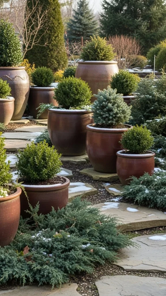
2. Pine Green and Weathered Wood
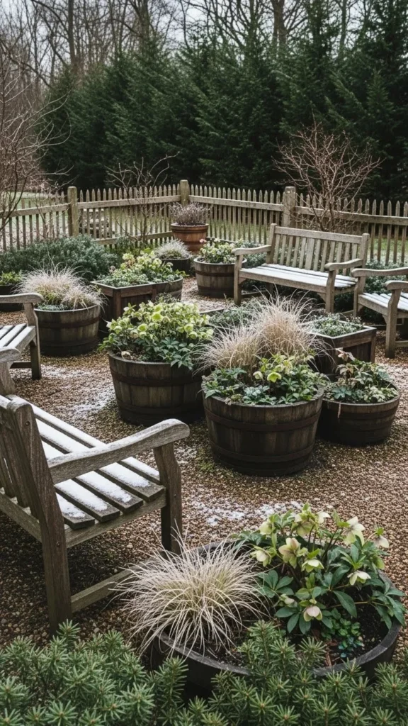
Weathered wood brings warmth to winter gardens without adding clutter.
Pine green foliage pairs naturally with aged timber.
Use old crates, pallets, or fence panels as planters or dividers.
If wood looks too dark, lightly sand it for a softer finish.
Budget tip: check reclaimed wood sections at local yards.
Add green wreaths or simple garlands to tie tones together.
This palette feels grounded and easy to maintain.
It suits larger gardens and rustic settings.
Even small balconies benefit from one wooden accent piece.
Let texture do the visual work instead of extra decor.
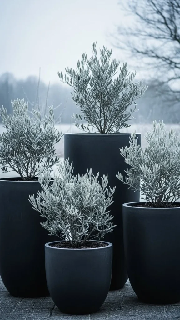
3. Charcoal Gray and Frosted Silver
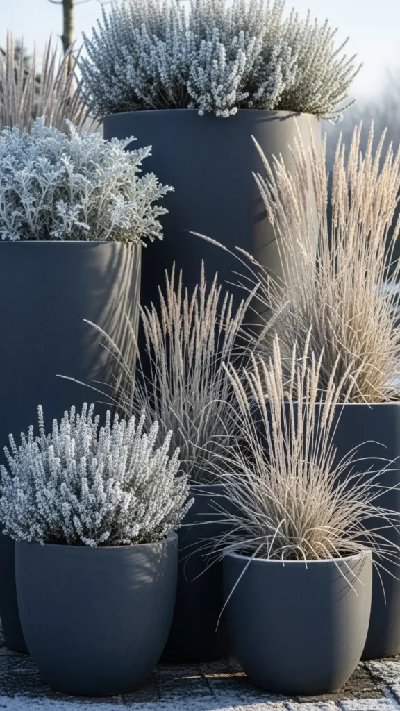
Charcoal gray adds structure and depth in winter.
Silver foliage and frosted grasses soften the darker tone.
Use gray concrete or resin pots for consistency.
DIY silver accents can come from spray-painted metal lanterns.
This look fits modern homes and minimalist layouts.
Limit accent pieces to avoid visual heaviness.
Silver plants catch light even on cloudy days.
Gravel paths in gray tones keep everything cohesive.
This palette works well for low-maintenance gardens.
Clean lines help the space feel tidy year-round.
4. Deep Green and Warm Cream
Warm cream softens winter greens without going stark.
Choose cream pots instead of bright white.
Outdoor cushions or throws can echo the shade.
Budget option: washable cushion covers swapped seasonally.
This palette suits seating areas and patios.
It feels welcoming even during short winter days.
Avoid mixing too many whites to keep warmth consistent.
Stone or ceramic accents work well here.
Even one cream bench can shift the mood.
Photographs beautifully in diffused winter light.
5. Forest Green and Muted Gold
Muted gold adds quiet warmth without shine overload.
Think brushed metal, not gloss.
Use gold-toned planters or lanterns sparingly.
DIY tip: lightly dry-brush gold paint on old decor.
Forest green keeps the look grounded.
This palette works for entryways and focal corners.
Avoid pairing with bright colors.
Keep textures matte for balance.
Gold catches light even on gray days.
One or two accents go a long way.
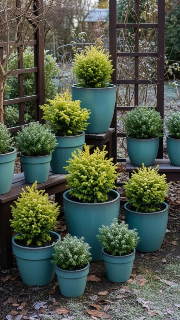
6. Slate Blue and Dusty Green
Slate blue brings calm to winter spaces.
Dusty green plants soften the cooler tone.
Paint old pots slate blue for a quick update.
This palette suits coastal or modern homes.
Add gray-blue gravel for flow.
Avoid bold blues that overpower the plants.
Layer similar tones for depth.
This look stays calm even in tight spaces.
Great for balconies and courtyards.
Keeps visual noise low.
7. Burgundy and Deep Evergreen

Burgundy adds richness to winter gardens.
Pair it with strong evergreen bases.
Use berry plants or red-toned leaves.
Budget idea: burgundy-painted pots near green shrubs.
This palette feels dramatic without extra decor.
Limit to two main tones.
Works well for fence lines or borders.
Great for seasonal interest.
Photographs well against neutral backgrounds.
Simple but bold.
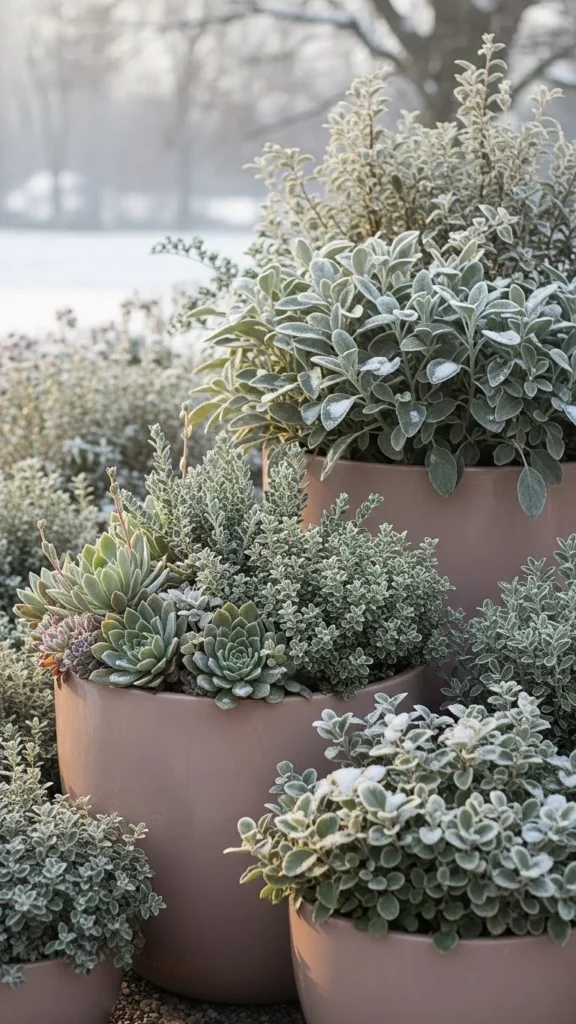
8. Soft Taupe and Olive
Taupe bridges warm and cool tones.
Olive plants blend easily with stone and wood.
Use neutral gravel or pavers.
Budget tip: reuse old pots with taupe paint.
This palette suits relaxed outdoor spaces.
It never feels busy.
Works in sun or shade.
Add woven baskets for texture.
Keeps winter gardens understated.
Easy to maintain visually.
9. Black and Snow White
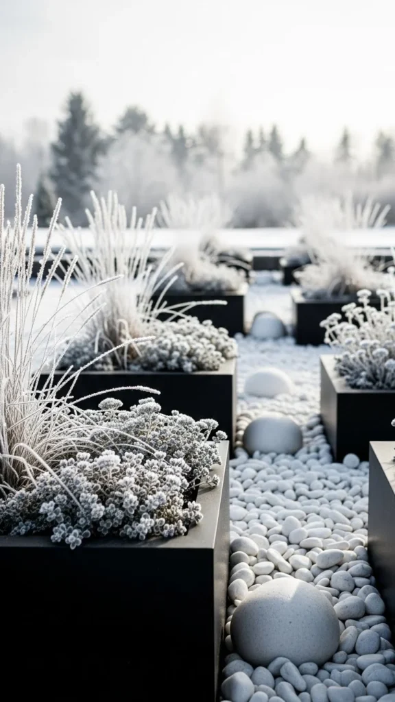
Black planters anchor the space.
White stones and pale plants add contrast.
Keep lines clean and simple.
DIY idea: repaint mismatched pots black.
This palette suits modern homes.
Avoid adding extra colors.
Contrast keeps the garden sharp.
Works well in small areas.
Snow enhances the look naturally.
Very Pinterest-friendly.
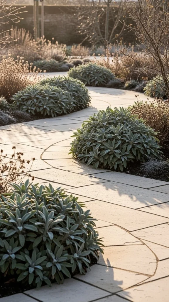
10. Moss Green and Stone Gray

Moss green feels natural and calm.
Stone gray adds stability.
Use ground cover or shaded plants.
Gray walls or edging complete the look.
Budget option: gray concrete blocks.
This palette suits shaded gardens.
Minimal decor required.
Let plants lead visually.
Low upkeep feel.
Very grounded style.
11. Muted Teal and Soft Brown
Muted teal adds personality without brightness.
Soft brown wood balances it out.
Paint pots or small furniture teal.
Use brown mulch or wood chips.
This palette feels creative but controlled.
Limit teal to accents.
Great for creative gardeners.
Pairs well with evergreens.
Photographs well against neutral homes.
Adds color without clutter.
12. Gray-Green and Linen White
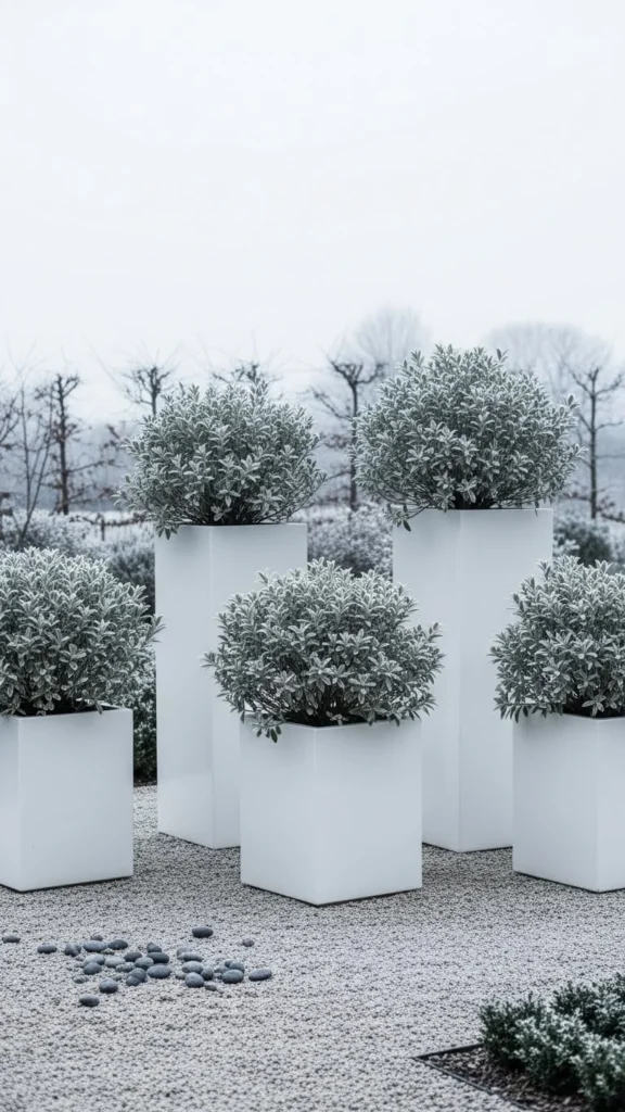
Gray-green plants feel calm and understated.
Linen white keeps warmth present.
Use fabric textures where possible.
Budget idea: whitewashed terracotta.
This palette suits cottage gardens.
Feels relaxed and soft.
Avoid bright whites.
Layer similar shades.
Works well near seating areas.
Very easy to style.
13. Navy and Winter Green
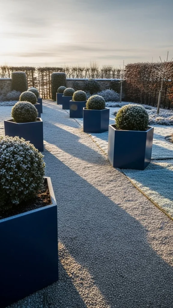
Navy adds depth without overpowering.
Pair with strong green plants.
Paint planters navy for contrast.
Keep surrounding elements neutral.
This palette works for formal layouts.
Great for framing entrances.
Avoid adding lighter blues.
Let green remain dominant.
Simple and bold combination.
Clean visual impact.
14. Clay Red and Evergreen
Clay red warms winter spaces instantly.
Evergreens keep it grounded.
Use terracotta or red-toned planters.
DIY tip: breathable outdoor paint refreshes old pots.
This palette suits traditional gardens.
Avoid glossy finishes.
Natural textures shine here.
Works well near brick homes.
Keeps winter from feeling cold.
Easy seasonal update.
15. Pale Blue and Soft Gray
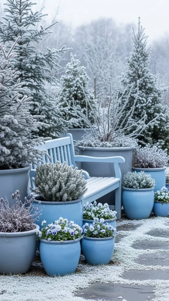
Pale blue brings lightness to gray days.
Soft gray keeps balance.
Use blue cushions or small decor pieces.
Avoid bold blues.
This palette suits small patios.
Feels calm and airy.
Layer textures for depth.
Gray gravel supports the look.
Simple to maintain.
Subtle winter charm.
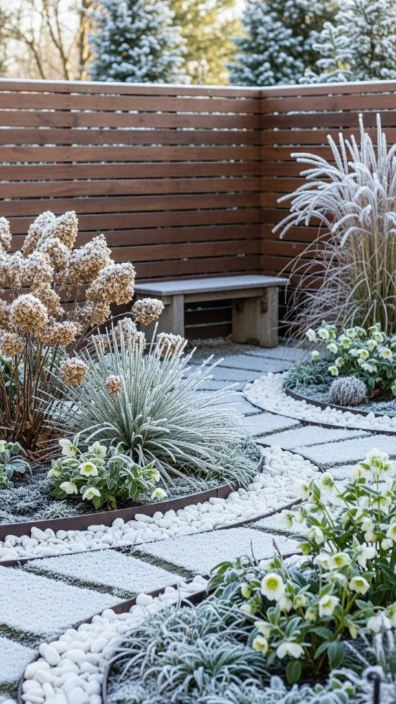
16. Dark Chocolate and Pine Green
Dark brown wood feels rich and stable.
Pine green adds life.
Use stained wood furniture or planters.
Budget option: wood stain refresh.
This palette suits larger gardens.
Feels cozy without clutter.
Limit decorative items.
Let materials speak.
Works well near trees.
Strong winter presence.
17. Soft Blush and Gray Green
Blush works even in winter when muted.
Pair with gray-green plants.
Use blush sparingly.
DIY: light spray paint on small pots.
This palette suits sheltered areas.
Feels gentle and styled.
Avoid pairing with bright colors.
Works well for Pinterest photos.
Simple and charming.
Unexpected but calm.
18. Cream Stone and Sage
Cream stone brightens winter spaces.
Sage adds subtle color.
Use stone pavers or edging.
Budget tip: stone-look concrete.
This palette suits walkways.
Feels balanced and natural.
Minimal decor required.
Let plants soften hard lines.
Works in many climates.
Timeless appearance.
19. Cool Gray and Lavender Green
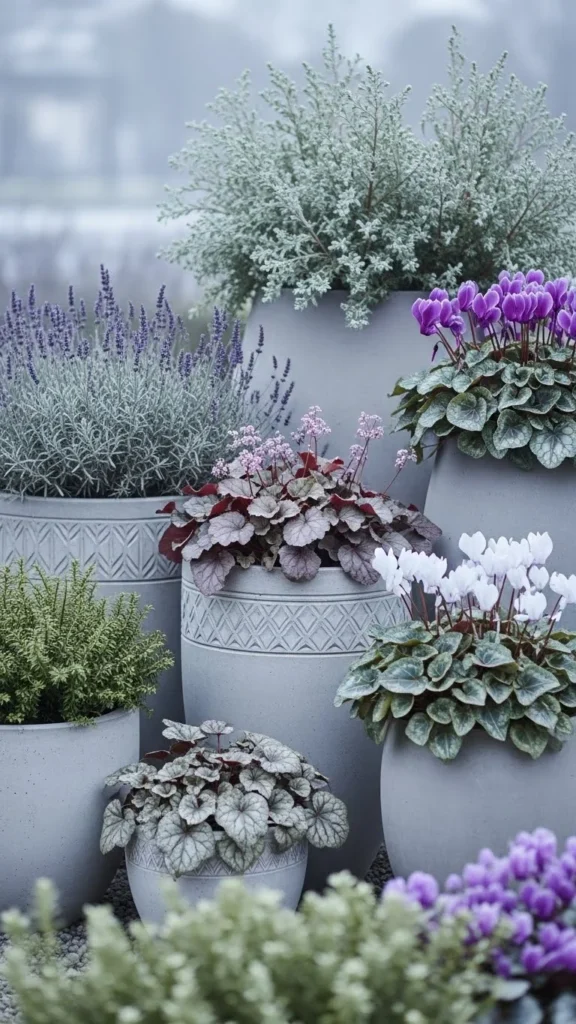
Lavender-green plants bring gentle color.
Cool gray supports them.
Use gray planters consistently.
Add small lavender-toned plants.
This palette feels soft and calm.
Avoid strong purples.
Great for borders.
Easy to replicate.
Keeps winter gardens gentle.
Light visual impact.
20. Espresso Brown and Frosty White
Espresso brown anchors the garden.
White stones or planters brighten it.
Use contrast carefully.
DIY idea: stain wood darker.
This palette suits structured gardens.
Feels clean and grounded.
Limit extra decor.
Snow enhances contrast naturally.
Photographs sharply.
Strong winter style.
21. Muted Mustard and Evergreen
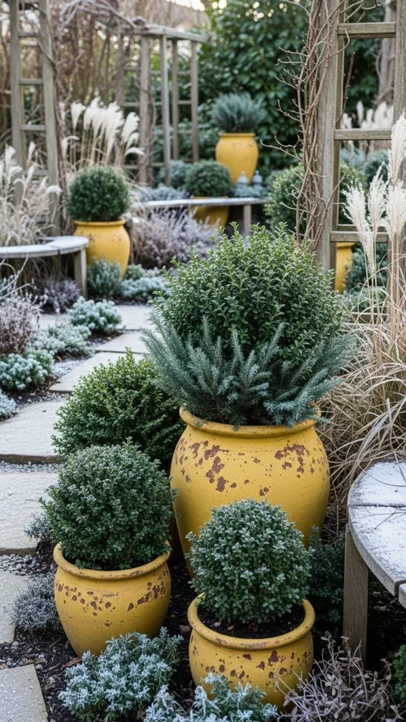
Muted mustard adds warmth without glare.
Pair with solid green plants.
Use mustard sparingly.
DIY: repaint one focal pot.
This palette feels cheerful.
Works well near seating.
Avoid mixing too many tones.
Green keeps balance.
Adds interest to winter.
Small updates work well.
22. Ash Gray and Deep Moss
Ash gray feels calm and modern.
Deep moss green adds richness.
Use shaded plants.
Gray walls or fences help.
Budget option: fence paint refresh.
This palette suits quiet gardens.
Low visual noise.
Easy upkeep.
Works year-round.
Very stable look.
23. Soft Copper and Pine
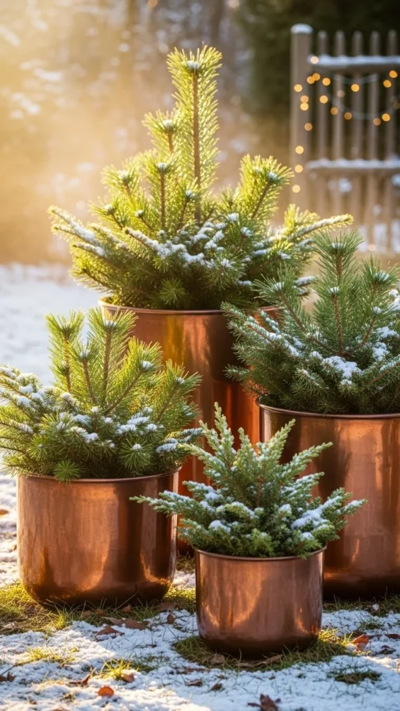
Soft copper warms winter gardens subtly.
Pair with pine greens.
Avoid shiny finishes.
DIY: copper spray with matte seal.
This palette works for accents.
Limit to small areas.
Adds glow without glare.
Green keeps it grounded.
Great for entry spaces.
Simple seasonal update.
24. Beige and Winter Green
Beige softens cold surroundings.
Winter green plants keep structure.
Use beige gravel or stone.
Budget tip: neutral mulch.
This palette suits relaxed gardens.
Feels natural and calm.
Easy to style.
Minimal decor needed.
Blends with most homes.
Timeless feel.
25. Charcoal and Olive
Charcoal adds strength.
Olive tones soften it.
Use consistent pot styles.
DIY repaint works well.
This palette suits modern spaces.
Avoid adding lighter greens.
Keep decor minimal.
Strong winter contrast.
Works in sun or shade.
Clean visual flow.
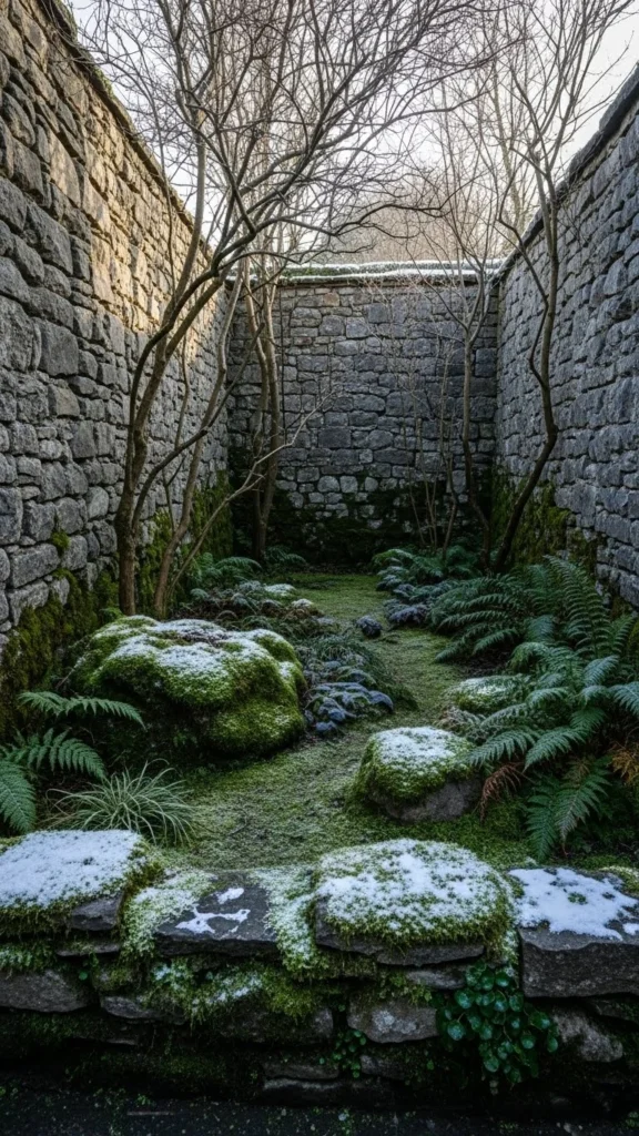
26. Soft White and Bare Branch Brown
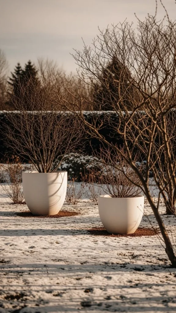
Bare branches add structure.
Soft white highlights them.
Use white planters near trees.
Budget idea: whitewash old pots.
This palette feels calm and honest.
No extra decor needed.
Branches act as design features.
Perfect for winter minimalists.
Easy to maintain.
Very photogenic.
Conclusion
Winter gardens gain character when color choices feel intentional rather than seasonal filler. These 26 winter garden color palettes show how simple combinations can shape outdoor spaces using everyday materials, repainting projects, and thoughtful plant pairings. Start small with one area or planter group, keep tones limited, and focus on contrast and texture. Save your favorite ideas, test them one corner at a time, and let your winter garden feel styled even on the coldest days.

Leave a Reply